Tips van de zakelijke fotograaf
What colour to wear for your corporate headshot
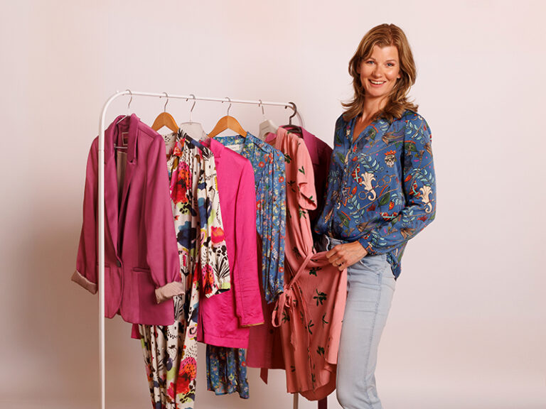
The short answer: choose colours that flatter your skin, sit calmly in the frame and strengthen how you come across. Navy, teal and warm green suit almost everyone and give a portrait immediate credibility.
Bright red or neon? Rarely works. Red tends to block up on camera and shouts for attention that belongs on your face.
After twenty years of photographing business portraits, I see the same thing every time: the right colour lifts a photo, the wrong one quietly undermines it.
Why colour matters more than you’d expect
The shade you wear affects how fresh you look, how professional you come across, and whether people remember you.
The camera amplifies all of it. A colour that looked fine in the mirror can turn harsh, flat or tiring on screen — while a colour that genuinely suits you brings life to your skin and strength to your gaze.
That’s why I pay attention to it. Not because it’s a nice extra, but because it shapes how you’re seen.
Colours that almost always work
Navy, teal and warm green flatter most skin tones and read as professional without effort.
Burgundy or aubergine are strong without dominating.
Warm sand and camel tones feel approachable, particularly if you have warmer undertones.
Colours that need more care
Bright red takes over the frame and often blocks up on camera. Burgundy gives you the same strength without the noise.
Neon shades make an image restless and pull the eye away from your face.
Pure white or deep black can work, but often read as harsh. Pair either with a second layer — a blazer or cardigan — for balance.
What different colours communicate
A business portrait isn’t only about how you look. It’s about what you convey. Every shade prompts something in the viewer, so choosing deliberately strengthens your message as well as your appearance.
- Navy — dependable, professional, timeless. The safe choice that suits almost everyone
- Teal — modern and confident without shouting. For anyone who wants a little more edge than navy
- Light blue — open, fresh, approachable. Good if you want to come across as easy to talk to
- Warm dark green or olive — calm, balanced, quietly trustworthy. Especially good with warm skin tones
- Rust, copper or brown — warm and grounded. Strong and human at the same time
- Beige and sand — soft and natural. Go for warm variants like camel; cooler beige can wash you out
- Aubergine or burgundy — polished and professional, with warmth rather than hardness
- Dusty pink — gentle and personable. Works well if approachability matters to you
- Black — authority and weight. Suits strong personalities, though it can read as distant
- White — clean and fresh, but combine it with something darker so you don’t disappear into the background
The question worth asking yourself: what do you want people to feel when they see your photo?
Which colours suit your skin
The good news first: mid-tones like navy, burgundy and warm green flatter almost everyone. If you want a safe answer, that’s it.
Want to be more precise? Then your skin undertone comes into play.
Cool undertone — pink or bluish skin, lighter eyes. Reach for blue-grey, emerald, fuchsia or cool teal.
Warm undertone — yellow or olive skin, green or brown eyes. Olive green, rust, terracotta and cream bring the warmth in your face forward.
Not sure which you are? Hold a sheet of white paper next to your face. A yellow cast means warm. A pink or blue cast means cool.
One thing people miss: only the colour next to your face counts. If you’re wearing a blazer over a blouse, the blazer decides how you look — not the blouse underneath, however well that colour suits you.

Colour when the whole team is photographed
Everything above still applies when your organisation is being photographed together. But something else comes into play: the photos will sit side by side on your website or intranet, so the set has to hold together as well.
The risk isn’t that someone looks bad. It’s that someone stands out for no particular reason — one bright pink jacket among twenty in navy and charcoal, and that’s where the eye lands first on the team page.
That doesn’t mean everyone in the same colour. It means giving people a direction in advance: dark or muted tones, nothing bright, no pure white. Within that, everyone can still choose what suits them.
For team shoots I agree the backdrop colour with the company beforehand, and that shapes what works too. Against a dark backdrop you don’t want dark clothing that people disappear into; against a light one you don’t want white. All of that goes into the briefing employees receive before the day.

In short
Mid-tones like navy, burgundy and warm green flatter nearly everyone. Avoid pure white without contrast, bright red and neon shades. Within those guidelines, pick the colour that suits your undertone and says what you want to say.
Organising a shoot for your organisation?
I photograph teams on location across the Randstad — briefing, schedule and make-up touch-up included.