What to wear for corporate headshots: what works and why
Your business portrait will be up there for years — on the company website, the intranet, your LinkedIn profile. What you wear on the day has more influence on how you come across than most people expect.
After twenty years of photographing teams across the Netherlands, I know which choices hold up on camera and which ones don’t. Here’s the thinking behind it, for individuals and for teams that need to look coherent together.
Start here: your clothing should support your face, not compete with it
In a portrait, the viewer’s eye belongs on your face. That’s where the story is.
Everything else follows from that. Colour is fine. Pattern is fine. As long as it flatters your eyes and skin and doesn’t pull focus away from you.
One thing I’d stress: wear sleeves. However warm the day, a sleeveless top or spaghetti straps reads as personal rather than professional in a business portrait — the frame runs from chest to crown, so your shoulders are very much in shot. A jacket or cardigan solves it in seconds, and comes straight off afterwards.
Why white is riskier than it looks
White is what a lot of people reach for, because it reads as smart and safe. It’s also where most of the missed opportunities are.
Two things happen. White bounces a lot of light, which can wash out your face — your skin loses colour and you look more tired than you are. And because white is the brightest area in the frame, the eye goes there first. To your shirt, not to you.
If you want something light, layer it. A blazer or cardigan over the top shifts the visual weight back up to your face.
The one nobody thinks about: fabric
This is the factor almost nobody considers, and it shows up on camera more than colour does.
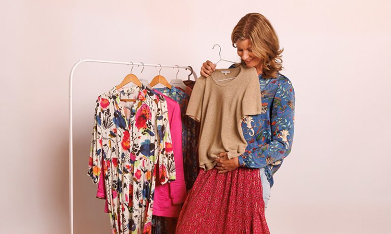
Shiny fabrics bounce light back. Satin, smooth silk, synthetics with a sheen — they create bright patches that make an image feel restless. What looks subtle in your bedroom mirror is far more pronounced under studio lighting.
Matte and woven fabrics do the opposite. Wool, cotton, tweed, knitwear: they absorb light instead of reflecting it. That reads as calm, and it gives a portrait texture and depth.
So when you’re choosing between two options in the same colour, go for the matte one.
And iron it. Studio lighting finds every crease. It’s not a small thing — it’s the line between looking put-together and looking like you got dressed in a hurry.
What the right colour does for your face
When someone walks in, I’m not asking whether a colour is nice. I’m asking what it does to the face in front of it.
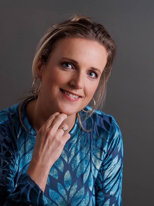
Take a warm green against brown eyes: the contrast lifts the eye colour in a way a neutral tone simply doesn’t. The principle holds more broadly — the right colour beside your face sharpens your eyes, warms your skin and strengthens your gaze.
Which colours those are depends on your skin undertone, your eyes and your hair.
Corporate headshots for a whole team
Here’s a question that doesn’t come up with a single portrait. The corporate headshots will sit side by side on your website or intranet, so it’s not only about whether each person looks good — it’s about whether the set holds together.
Worth deciding in advance: will anyone stand out, and do you want them to? If a department turns up in navy, charcoal and green and one person arrives in bright red, that’s where the eye lands first on the team page. Sometimes that’s the point. More often it isn’t — and it’s better to have chosen either way than to find out afterwards.
That doesn’t mean everyone in uniform. It means giving people a direction. Something as simple as: dark or muted tones, no white, nothing bright, plain or subtle patterns. Plenty of room for personal taste, enough structure to keep the set calm.
There’s a practical side too. Time per person is limited at a team shoot, so what people walk in wearing is generally what ends up in the photo. That’s why I send a briefing out in advance, covering clothing, hair and make-up. Everyone knows what to expect, and it’s settled well before the day itself.
The backdrop shapes what works
For a team shoot I choose the backdrop colour with the company. It isn’t a cosmetic afterthought: the backdrop sets the tone of the image and determines which clothing works against it. These four come up most often.
Grey is the reliable choice. Neutral, professional, and almost every outfit and every complexion sits well against it.
White feels open and fresh, though in some sectors it can tip into clinical. Occasionally that’s exactly right; often it isn’t.
Navy gives a stronger, more polished result — precisely because it isn’t a loud colour. It suits organisations that want to project a degree of authority.
Brown is a classic and you rarely see it, which is what makes it distinctive. It’s particularly good with navy clothing, which most people already own.
Plenty of other options exist — we’ll find what fits. What we look at: your brand identity, your logo, your website, and how you want the organisation to come across. From there we work out which clothing direction supports it.

The short version
- Clothing should draw the eye to your face, not away from it
- Colour and pattern are fine when they flatter you
- Only wear white with a darker layer over it
- Matte beats shiny
- Iron it
- For teams: set a direction in advance so the whole set holds together
- Match the backdrop to the company, and the clothing to the backdrop
Organising a shoot for your organisation?
I photograph teams on location across the Randstad — briefing, schedule and make-up touch-up included.